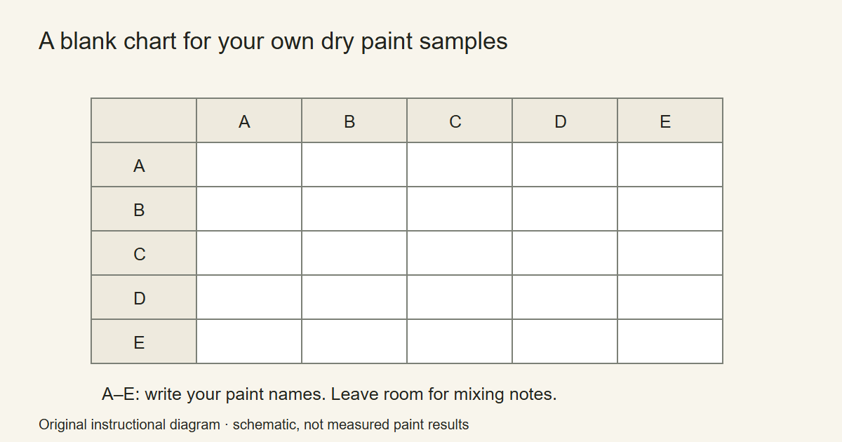
A useful acrylic color mixing chart records your paint, on your surface, after it dries. Put the paint names across the top and down one side of a grid. Paint the original colors along the diagonal, then use the other cells for pairs of those paints. Label the mixtures instead of relying on memory.
The blank worksheet supplied with this guide has no simulated paint results. Fill it with real samples. Screen colors would give a misleading impression of what every brand, pigment and mixing ratio will produce.
Start with a manageable group of paints
Choose a few colors you already use together. For a small first chart, select a yellow, a red or magenta, a blue and an earth color, then include your white. This is a practical exercise choice rather than a shopping list for the only correct palette.
Write down the manufacturer, range and full paint name. If pigment codes are printed on the label, record those as well. Two tubes with similar names are not necessarily the same formula. A manufacturer’s chart, such as the Liquitex acrylic fundamentals poster, helps you see the sort of pigment information available.
Keep the surface consistent. Use acrylic paper, a prepared panel or a spare piece of the support you intend to paint on. Leave a little unpainted space around each sample so the labels remain readable.
Make the grid useful before filling it
Draw the same paint names along the top and down the left. Put the neat paint where a row meets its matching column. These diagonal samples give you something to compare with the mixtures.
For the remaining cells, combine the row paint with the column paint. You can begin with similar-sized portions as an experiment, but do not assume equal portions create an equal-looking mixture. GOLDEN’s mixing guide explains that paints differ in tinting strength. Add the stronger-looking color gradually when you want more control.
Use the unused half of the grid for an alternative proportion, or repeat the mixture with white. Choose one system and write it on the sheet. Without that note, a completed grid can be attractive but difficult to use again.
Paint, dry and label each sample
- Put the first pair of paints on a clean palette.
- Mix a small sample with a palette knife or spare brush.
- Paint the cell and note which paint you added to adjust it.
- Clean the mixing tool before starting the next pair.
- Return to the sheet after it dries and write the observation beside the sample.
Useful notes are specific: “blue dominates,” “transparent over the pencil line,” “warmer after adding more red,” or “white gives a pale tint.” These are observations for you to make, not results this guide claims on your behalf.
GOLDEN discusses changes between wet and dry acrylic appearance, including their variation by color. That is why the final dry sample belongs on the reference sheet. Do not give every acrylic a single percentage for how much it will darken.
Make a separate white test
Take a small portion of each neat color and add your white in stages. Place the resulting tints beside one another. Write the type of white on the sheet.
This exercise helps separate two questions: how light a mixture is and how well it covers the surface. GOLDEN distinguishes those qualities and notes the different behavior of Titanium White and Zinc White. Avoid treating every tube labeled white as interchangeable.
If a mixture is too thick for the mark you want, make a separate thinning test. Keep the original chart’s mixtures as comparable as possible instead of altering their consistency in different ways without notes.
Use the chart to plan one painting
Put the dried chart beside a reference photograph or sketch. Choose a small set of mixtures for that painting, then label those choices on a scrap. The chart should reduce the number of decisions you make halfway through a wet passage.
For the sunset painting exercise, find an upper-sky mixture, a pale warm horizon mixture and a dark foreground color. You do not need to use every successful mixture from the chart in one canvas.
The GOLDEN virtual mixers are another way to explore possible combinations. Keep the dried chart as the reference for your physical materials, surface and application.
Where the color wheel fits
A mixing chart records specific mixtures. A color wheel helps describe relationships between colors. Artistry By Numbers’ explanation of tertiary colors is useful when you want names for the intermediate positions around a traditional wheel.
Do not replace the paint names on your chart with only those color families. “Blue-green” tells you a relationship; the actual tube names and your notes tell you how you made the sample. Keep both kinds of information when they help.
For the next chart, change only one paint or one support. Date the sheet and keep the earlier version. Over time, those comparisons give you a record of your own materials without borrowing someone else’s color recipes as guarantees.
Acrylic Painting Ideas and Artistry By Numbers are owned by OmniLearnConsultingCommerce LLC. Links to Artistry By Numbers lead to our related painting business.
Illustrative image: Red and yellow paint palette by quattrostagioni, CC BY 2.0. Cropped and resized. Illustrative palette photograph. Fill the blank worksheet with your own dry paint samples.