Acrylic mountains: separate distant ridges with value
In this guide
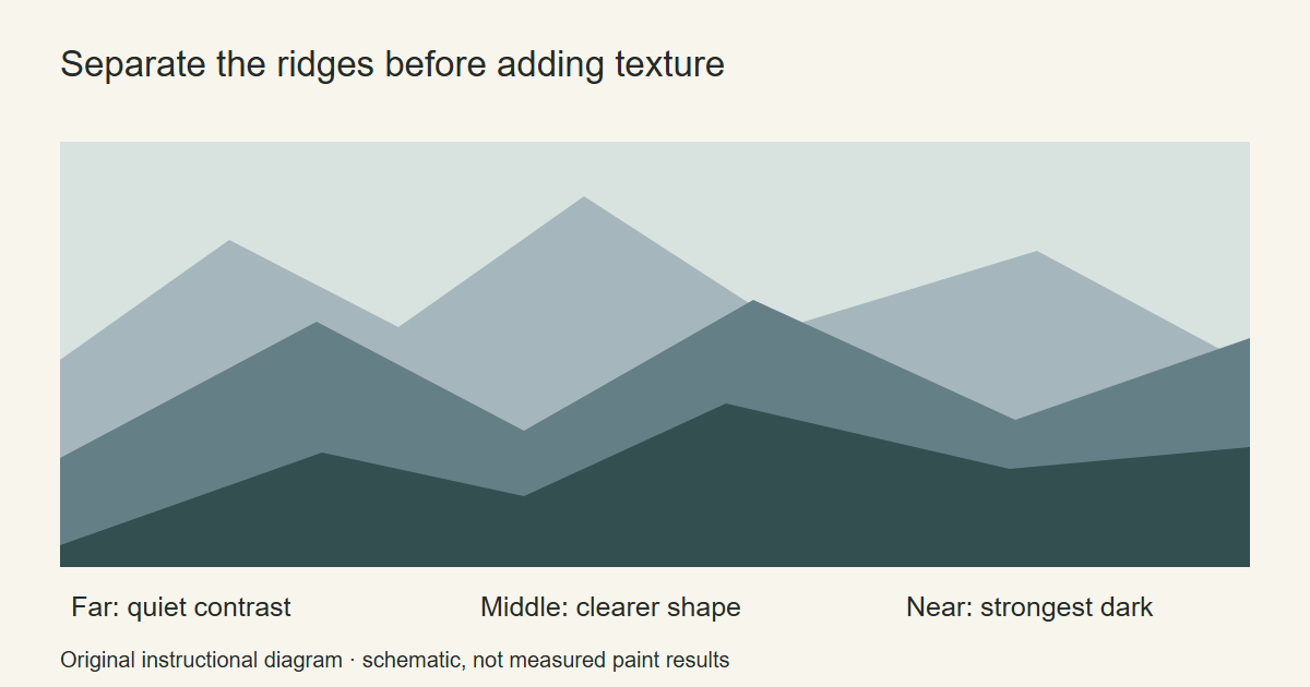
Begin an acrylic mountain painting with the ridge shapes, not the rock texture. Sketch a distant range, a middle range and a foreground slope. For this practice version, give each range a distinct value and let the shapes overlap. You can judge the arrangement before adding a single tree or snow mark.
The diagram is an original composition exercise. Its color bands are schematic guides, not measured paint mixtures or a photograph of a finished acrylic demonstration.
Choose which ridge should carry the painting
Draw a small horizontal rectangle on scrap paper. Make one peak the main feature and let the other ridges support it. Try moving that peak left and right in a few thumbnail sketches. Keep the most useful sketch beside the canvas.
Vary the ridge contours. A sharp peak beside a long low shoulder is easier to compare than a row of identical triangles. Allow part of each farther range to disappear behind a nearer one. These are composition choices for this exercise; use your reference if you are painting a particular place.
Use a photograph you took or a reference whose license permits your use. Do not assume a search image is available to reproduce. A reference helps you check where the major planes change direction, even when you choose to simplify them.
Test the value pattern before choosing the blues
Make a small study with one dark paint and white. Paint the sky and ridges as broad, flat shapes. In this version, keep the farthest ridge close to the sky’s value and reserve the strongest dark for part of the foreground.
Look at the study from farther away. Can you still identify the overlapping ranges? If the shapes merge, adjust the difference between two neighboring areas before adding texture.
Canson describes reducing background contrast as one way to create depth. The Met’s discussion of a landscape by Jan van Goyen provides an example of atmospheric perspective in an actual painting. Neither source means every mountain must be a fixed shade of blue. Weather, light and the chosen style can change the scene.
Prepare a small family of mixtures
Once the value study reads clearly, choose colors for the same arrangement. You might use a restrained blue for the distant range, a stronger blue-gray for the middle range and a darker earthy mixture for the foreground.
Put a dry sample of each beside the others. Judge the relationships together rather than trying to mix a universal “mountain color.” Record the tubes you use on a color mixing chart so you can make another portion later.
Keep enough of each main mixture aside for corrections. A little clean palette space between mixtures makes it easier to return to one without pulling in several unintended colors.
Paint from the broadest areas to the smaller planes
Place the sky first and allow it to dry for this version of the exercise. Lightly mark the ridge contours, then fill the farthest shape. Let that area dry before placing the next ridge over it. Continue toward the foreground.
Use a brush that can fill the shape without tracing it as a thin outline first. Canson’s opaque acrylic technique similarly moves from large areas to finer marks. That is the useful principle here, rather than copying the colors or proportions of another lesson.
Now choose one face of the main mountain to receive a lighter plane. Paint it as a connected shape. Compare its edge with the peak and the neighboring shadow. Keep the distant range simpler so the detail has a clear place to belong.
Add only the rock or snow marks that explain the form
Try a few broken, directional marks on scrap. Then select one part of the main mountain for them. Follow the slope you want to describe rather than scattering identical dashes across every ridge.
For snow, use a lighter mixture whose value separates it from the underlying plane. Leave gaps where the darker mountain can show. The aim is a readable patch following the form, not an outline around every white mark.
Pause before adding a tree line. If a distant ridge already works as a quiet silhouette, it may not need individual trees. Keep the first foreground to a low connected silhouette. The acrylic painting ideas guide can help you choose a separate foliage study.
Repair the value arrangement before adding detail
If the scene feels flat, compare it with the thumbnail study. Cover a small paper shape with the value you are considering and hold it near the painting. That lets you compare a change before repainting a large area.
If one ridge is too busy, let it dry and simplify a section with its base mixture. If two peaks compete, soften the contrast on the one you want to recede. Judge the painting again from a distance after each change.
For a prepared mountain design, look through the landscape kits at Artistry By Numbers. For another freehand study, repeat your thumbnail with a different peak arrangement while keeping the same small palette. That gives you a clear new composition problem to solve.
Acrylic Painting Ideas and Artistry By Numbers are owned by OmniLearnConsultingCommerce LLC. Links to Artistry By Numbers lead to our related painting business.
Illustrative image: Mountain ridge seen through wide valley by Horia Varlan, CC BY 2.0. Cropped and resized. Licensed reference photograph; not a photograph of a painting produced for this tutorial.